
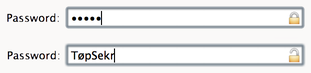
Password entry: Masking/Unmasking control for password inputs
Smashing Magazine today published a blog post Better Password Masking For Sign-Up Forms. It suggests that a masked password (where the letters are replaced with ••••••) isn't such a great idea for making an account because you can't see what you have typed. Even if you are asked to enter a new password a second time, it still leaves the possiblity of error.
One suggestion it makes is to unmask the password when the field is focused. That's an intresting idea, but not a great idea if there is a curious person looking over your shoulder.
The final suggesion is a checkbox, where the user can choose whether to mask or unmask the password. That's probably the best compromise, since it lets the person typing the password control things.
(In fact, we're doing something like that on the upcoming version of Sandvox where you are prompted for a password to access a server where your website will be hosted.)
The problem with this approach is that it's up to the creator of the web form to implement that behavior. It's also kind of klunky because it's not really obvious where the checkbox should be placed. Below the field? Above it? To the side?
What if, instead, there came into being an adjustment to the password input control on desktop computers that just included the mask/no-mask option in it?
(Here's a super-quick mockup.)
Designing the Perfect Credit Card Payment Form
I recently wrote a post about how much I love Stripe, and why we changed Karelia Software's online store to use Stripe to process credit cards for people purchasing Sandvox.
This is a followup to that, describing what we did to build our online store, and what decisions came into play for its user experience. (In another followup post, I'll discuss more of the back-end pieces we're using.)
When I realized that we could do just about anything we wanted to collect payments without the limitations we had before, I started looking around at a lot of online stores. I visited websites of fellow indie developers. I looked at the big online retailers. I looked at large retailers with an online presence.
And you know what? Everybody seems to have a different way to collect payments.
For example: some sites take you through multiple steps as you fill in your information. Fill in some fields, click a button to go to the next page, fill out another page or two, and eventually you're done. Others, on the other hand, collect all the information at once, with a single submit button at the bottom.
Different sellers handle input validation and errors differently. Some are proactive, offering helpful suggestions along the way if it looks like you have made a mistake; others wait until you have submitted the form to provide any error messages for you to collect.
After looking at examples and reading some online articles about payment form best practices, I started working on some iterations and refining them with Terrence's and Mike's input.
One overarching goal was to keep the form looking very friendly and simple, but allow for some more complicated scenarios (such as handling coupons or purchasing a gift license).
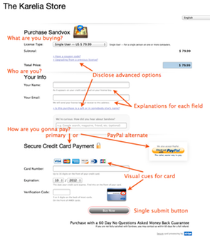
First off, I decided that we wanted a single-step form; it seems to me that the fewer steps there are, the fewer chances we will lose somebody along the way. We wanted to make sure there were plenty of explanations of what the input fields are for, and why we need them. We wanted as much real-time input validation as possible so that there would be a live status update as the visitor clicks from field to field. (More on that in the followup post.)
To keep the more advanced options out of the way, we used simple text links (prefixed with a right-facing disclosure triangle) to allow additional sections to be revealed only if needed.
We put plenty of explanatory text below each field, to provide context for each input. That text even adapts as needed when additional options are disclosed. (Example: the explanation for "Your Name" changes if an advanced section is disclosed.)
Though the inputs are all collected in a single form submission, we felt it was important to group the similar types of input together into discreet chunks. We came up with three main sections: What the visitor is buying — from this a price is calculated. Then, who the license is for. Finally, the actual payment.
As I mentioned in my previous post, we wanted to keep PayPal an an option as well. So after a few iterations, we came on the idea of putting the PayPal button off to the side, at the top of the section where we deal with payment. This lets the visitor choose how to pay after we've collected the other information we need. The normal path is to continue and enter the credit card information, but they can veer off that path and use PayPal instead. This approach seems to work pretty well.
To reassure the visitor that this form is safe, we use the word "secure" above the payment section and feature a lock icon if it's an HTTPS connection. Plus, we link to Stripe and their security page at the bottom.
In the field for the credit card number, we do something clever inspired by GitHub's payment form. Like GitHub, we show icons for the credit cards that Stripe can process. But as the visitor types in a number, the first couple of digits indicate which type of card they are using, so we highlight the card they are using and fade out the others. No point in asking them what type of card they are using; this approach means one less step for the visitor to take, but it visually reinforces the card that they are using.
Naming and explaining the field for the 3- or 4-digit CVC/CVV2 code is never easy, and it varies greatly from website to website. We decided to call it "verification code", explain it below the input field, and provide a little thumbnail for where it can be found on a typical credit card.
Since this code is on the back of most cards but on the front of Amex cards, we do something kind of fun. If you enter an Amex number — try typing "34" in the Card Number field — we animate the card to flip over to show the front of an Amex card. (Also, we highlight the explanatory text referring to the Amex location.) Try it!
That covers most of the design decisions for how to present the credit card input form. Next time around I'll describe what we are doing on the back end to deal with validation, internationalization, and dealing with unfinished transactions.
For the comments: How might you improve this form? (Despite the title, I don't think this is perfect by any means, and maybe there are more improvements we can make to it!) What are some other nice things that companies have done for their payment forms?
iPad Mini: Developers will need to make their touchable elements bigger
With the introduction of the iPad Mini today, I noticed that Apple's guidelines for the minimum size for touchable elements, 44x44 points, is probably no longer valid.
Because the screen size is 1024x768 in spite of the smaller form factor, that means that 44 pixels is going to be significantly smaller than 44 points.
I did some quick calculations based on the published specs for the iPad Mini, and it looks like the screen size is 81.44% of the size of the full-size iPad.
This means that apps should probably consider that their minimum touchable size is 54 x 54 pixels.
Or, developers can just assume that people with the iPad Mini have skinny fingers.
There are a lot of apps on the app store that are going to be difficult to use on the iPad Mini, I think.
Or did I miss something here?

Update: Thanks to Kris in the comments, who linked to this article. I guess iPad developers have already been designing iPad elements bigger than they needed to be (to maintain iPhone compatibility, with its denser pixels) so now the new iPad Mini just brings the density down to the same as the iPhone. Whew!
Safari's History Menu Sucks
I've still been using Safari in spite of its slow decline over the last year or so. (Is it just me, or is it just buggy somehow?) After seeing nearly every presenter at the recent HTML5DevConf using Chrome, I guess I'm not alone in my frustration with Safari.
Still, out of habit, I've held on.
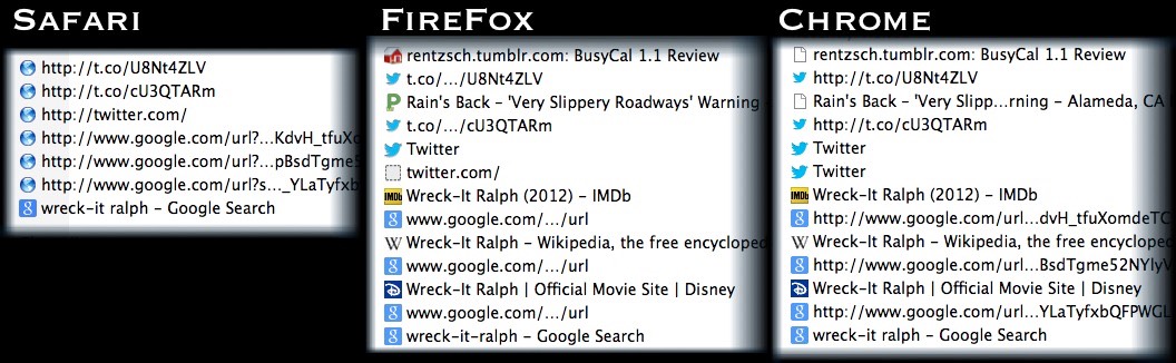
Today, I became conscious of something that's bothered me for a while. Let's say you do some Google searching, and then you want to use your History menu to view some pages you found earlier. But the pages you found aren't there. Instead, some obscure Google URLs.
Or perhaps you were on Twitter, clicking on some links, and you want to go back later and re-open some of those URLs you found. Yet your history shows only the shortened "t.co" URLs.
Not very useful!
Compare Safari to Firefox and Chrome.
Yes, I reported it to Apple, Radar 12549677. I guess I still have hopes that Safari will get better again.
P.S. Chrome, what's up with the favicons?
Wild Images, Inspired by Shades of Grey by Jasper Fforde
[Note: If you are reading this via RSS, you're better off opening the page so you get the proper photo viewer.]
A couple of weeks ago, I read Shades of Grey, a novel by Jasper Fforde (author of the Thursday Next books).
It was just such a cool book. I just can't stop thinking about it.
Have you ever read a book, and then wished you could see a movie version of it? This is one of those books.
The story is a vaguely dystopian future England, where people live in a social hierarchy separated by color: a colortocracy. No, not skin color, but their eyes. No, not the color of their eyes [hat-tip to Haile Selassie] but people's color perception. Based on what color or colors you can see depends on where you are on the social strata. Purples (who can see red, blue and purple combinations thereof) are at the top; Reds are at the bottom. And greys are the untouchables.
You should read the book. Warning, though: it's the first of a trilogy and the next part isn't due until … 2015. Yeah.
In the meantime, I have gotten somewhat obsessed with what it must be like to only be able to see a part of the spectrum. If somebody were to make a movie of it (say, Gary Ross, who did Pleasantville), viewers would probably want to see the perspective of various characters in the book.

So after some digging around, I finally figured out how to do it, using PhotoShop and Lab color mode. For a "blue" photo, for example, I'd set the "a" channel to 50% gray to remove all red and green, and apply a curve like this to remove all the yellow from the photo.
The result is something like this. A Blue would really appreciate the sky!

Here's an example of what a Red would see. If you have read the book, you will notice that woman is clearly proud of her spoon, and takes good care of it! There's a lot of red in human flesh tone, so a Red would be pretty fortunate. He or she would also be able to tell when somebody is blushing, but other people wouldn't — much to the relief of the Eddie, the book's Red protagonist.

Yellows aren't so fortunate with people, but as we'll see further down, at least they can appreciate some of nature's colors.

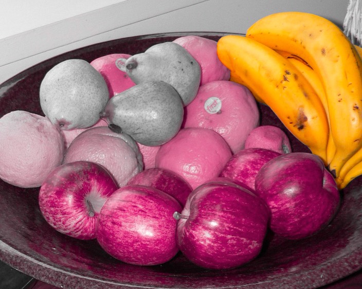
Take a look at this photo, then check out what it would look like from various chromatic perspectives:


Here are some examples of how people might be perceived.


This ruined tower scene doesn't hold much for Reds.


To finish up, here's a Red's perspective of a man in a Model T, and a Red's perspective of a plate of fruit — the bananas are artificially colored, of course!

Photos from Flickr. All modifications (cc).
Ruined Barn photo credit: .aditya. cc
Woman using spoon photo credit: bigredpenguin cc
Man using spoon photo credit: Aplomb cc
Garden Wall photo credit: UGArdener cc
Kids photo credit: sharkbait cc
Tower photo credit: cookipediachef cc
Fruits photo credit: Sandy Austin cc
Model T photo credit: dok1 cc
via photopin
Dear nitpickers: This is just based on fiction, so please don't worry about any disagreements you have with human color perception, color modeling, or the likelihood of Model T cars surviving the Something That Happened.
Dear Mr. Fforde: Hurry up with that next book! And let's have a movie of this! KTHXBYE.
Conference Overload!
Boy there are sure a lot of Mac development conferences these days. The latest, which I only heard about from people tweeting about it, was Çingleton, in Quebec. Too bad I didn't hear about it — I've always wanted an excuse to go to Quebec!
Clearly, these conferences need to work on getting the word out better. Then again, I suppose if they are successful and sell enough tickets, maybe they don't.
In the meantime, I managed to go to a small conference earlier this week, HTML5DevConf in San Francisco.
Most of the attendees were HTML and JavaScript folks, not so many Mac developers – though I did run into a few.
The keynote: "Cache is King" had a lot of great advice for webmasters. If you have a website, you might want to look at how your site is handling caching issues!

Get Thee to a Maker Faire
Today was the second annual "Mini Maker Faire" in Oakland. It's essentially a smaller version of the main Maker Faire in San Mateo that's been held each year in May for the last several years.
If you've never been to one, and you have any geeky tendencies — especially if you also have inquisitive kids — you should keep your eye out for one! I hear there are fairies in Portland, Ottawa, Toronto, Vancouver, New York, and so forth. I heard talk of a San Francisco one coming soon too.
There is so much going on! I took this GoPano video of a typical scene. Near me was a station where (mostly kids) could build popsicle stick structures and then test out their stability on earthquake simulations of different soil types, air-pressure-powered paper tube rocket making and launching, an outdoor wood-fire oven where people could make pretzels, a solar oven demonstration (waiting for the sun to come out), and an art space.
Of course there was so much more going on. Rides around the grounds on all kinds of creature/bicycle hybrids. Demonstrations of urban farming like beekeeping and raising backyard chickens. Crafts for making, or crafts for sale. Build your own floating landscapes for a serene "water temple." Fire-belching machinery. Blacksmithing demonstrations. Mylar creativity. 3-D printer demonstrations. Lots of food trucks. And more.
Highly recommended.
Neighborhood Happy Hour

Summer of 2012 has been a very nice summer, thanks to some neighbors who had a very cool idea.
Every Friday evening, since about June, they've had a simple open invitation to their neighbors to hang out in their front yard for a "happy hour" or "TGIF" get-together.
Very casual: bring some drinks and munchies to share. Bring some outdoor chairs, or sit on lawn or the front steps. And kids are welcome too; there are babies and toddlers and kids and pre-teens and teens hanging out.
What a great way to get to know your neighbors! We're building bonds that are much stronger than the occasional "hi" while out walking the dog, or the annual "block sale" that brings nearly everybody out and about.
The turnout of the happy hour varies from week to week, so it's never the same.
It turns out that this phenomonon is not unique to our street. See, for instance, this, this, this, and this. Everybody's is different — some are more involved than others; some are monthly not weekly; some have even have a theme.
As the days get shorter as we head into Autumn, it is still warm enough in California to continue for a bit, but probably not a good time to start something like this up in other areas where it's getting colder outdoors. Of course there's always indoors, but that involves a bit more preparation and logistics. (Especially if you don't know your neighbors that well at first, it's probably easier to spend some time outdoors before you open up your house to them!) I'm not sure if we'll be able to continue quite as before now that it's getting colder, darker, and wetter. But it's been a great summer, and we have many more friends who happen to live right near me than we did before.
If you live in a place where you wouldn't mind getting to know your neighborhood a bit better, maybe this is something you might consider starting up when the weather permits it.
(Photo CC from Flickr by ozmafan)
A Year on the Mac App Store
Tomorrow marks one year that Sandvox has been available for sale on the Mac App Store.

With all its faults, it was a great decision to make the effort to get our app on the App Store. While we were a bit worried, it doesn't feel like it cannabilized the sales we would be making on our own store. The App Store is just another discovery mechanism and distribution mechanism, existing in addition to our own website and online store.
While I think the App Store is a great way to succeed, I don't agree with the decisions that a few of my fellow indie developers have made to stop offering their product on their own website and switch to the App Store exclusively.
In today's world, I think the best idea is to have your app available in both distributions. (Matt Gemmell offers some suggestions on that.)
Now let's hope that the App Store team will do something about these worsening review queue times. (It's not the actual review that takes a long time, but waiting to get reviewed.) Our latest update had us waiting a month, and it looks from submitted statistics and reports from others that it's affecting other developers as well.
These delays really cut into developers' schedules, and force some tough decisions. Whether to anticipate sitting on a new version for a month. Or to decide to let your self-released edition be kept up-to-date, letting the App Store version lag seriously behind. I suppose that's OK for minor updates, but what about if you have a major new update? If you want to send out press releases and garner publicity for a new version, it doesn't make sense to announce that it's available in one edition and a month away in another edition.
If only Apple Inc. had a little bit of extra cash, so that they could afford to hire a few more people on the App Store review team, to bring that review delay down to a week or less, as it was earlier this year!
Today's question for the comments: What can Apple do to improve the Mac App Store experience for its developers?
I 💜 Stripe 💳 Credit Card Processor
(OK, hope you can see those Emoji characters in the title!)
We recently started using Stripe as our main payment processor on our Karelia Software Web Store. I thought I'd sing its praises here.
For the past five years or so, we had been mostly using PayPal to collect payments from our customers. But I was never really happy with it being our primary way of processing credit cards. Yes, I've heard some horror stories about merchants' accounts being frozen, but my main issue was that it just felt slightly second-class. If I see a website that only accepts PayPal, it doesn't feel as much like a "real business" as one that processes the credit card themselves. Plus, I know there are a lot of potential customers who hate PayPal, or maybe it just doesn't work in the country where they live.
A couple of years ago, I looked into getting a full-fledged merchant account and setting up a shopping cart gateway, but it was absolutely daunting. Just understanding all of the pieces we'd have to get working, and the compliance hoops we would have to jump through was overwhelming, so I didn't make it far into my research.
I'd heard great things about FastSpring from fellow indie Mac developers, and we did actually use them as an alternate processor for a while, but I just wasn't that thrilled. They didn't integrate into our customer database system very well, and, like other similar processors, they function by taking users away from your site and onto their site. I don't like the idea of not having control over customers' experience or not being able to even measure how successful the interaction is, because buyers would be going off-site. Plus, it's hard to make the payment processor's site appear seamless to the user — it's usually obvious that they are going to another website.
So when I heard about Stripe, I was thrilled. Finally, a way to process credit cards that lets us control the experience on our own site, but also easy to implement.
Here are some aspects of Stripe that I like:
- It feels "native" to the customer. They stay on our website.
- It's much easier to implement than PayPal (with its crazy IPN and PDT notifications) or full-fledged payment gateways.
- The company and their website are very developer-centric. The documentation has examples in PHP, Curl, Ruby, Python, and Java! In fact, the documentation is "live," so that if you are logged in, the example code is hooked up to your test-data API keys, so you can just try it out right away.
- Technical support is just amazing. I had a bunch of newbie questions that were answered quickly and helpfully.
- Reasonable fees, close to PayPal, and way less than the full-service providers like FastSpring and eSellerate. (Here's a great argument against obsessing over a couple of percentage points).
- Extremely easy to try things out in a test mode before switching to live data. Much easier than PayPal's "sandbox" system.
- Web Hooks: Our server can get pinged when something happens. We have a script send us an email at the end of each business day when the day's charges have been calculated and a transfer to our bank account is queued up; the script also gets pinged if there is a chargeback on somebody's card — very rarely since we've switched to Stripe, BTW — so our system can automatically send the person an email to try and resolve the issue.
- Refunds can be done with an API, so we've hooked that up to our back-end application we use for looking up licenses. It's much easier than looking up somebody's transaction in our system, and then logging into PayPal to process the refund!
Don't get me wrong; Stripe isn't perfect (yet). Here are a few drawbacks:
- Stripe is only set up for US- and Canada-based businesses. They are slowly expanding into other countries, however. This isn't a big deal since we're US-based, but it might not be an option if your business is set up elsewhere in the world.
- They only accept US (and maybe now Canadian?) dollars. We would prefer to offer our product in the customer's native currency so they don't have to think about currency exchange.
- Funds collected are held, and not deposited into your bank account, for 7 days. With PayPal, theoretically you could get your money out of PayPal and into your bank in just a few business days. (Then again, some processors make you wait a whole month to get your money. So seven days isn't really a big deal.)
- JavaScript is required for the processing to work. Then again, so what. PayPal requires JavaScript too.
- Credit Card Security Codes (that three- or four-digit code you have to enter in a lot of forms) aren't really checked adequately using the current APIs. Hopefully they'll improve the APIs so we can require the code to match before letting a charge through.
These are not major issues, though — at least for us. So we're using Stripe now.
We are also continuing to use PayPal, in parallel, as an alternate method of payment. What have we got to lose by continuing to support PayPal? It seems that a decent chunk of our customers prefer to use PayPal. I can see how people who know and like PayPal would choose to pay that way. If you were familiar with PayPal, and you were buying something from a company you've just learned about, would you trust your credit card to them, or use PayPal for the 20th time?
How Stripe Payment Processing Works
For those who are technically inclined, here is how Stripe manages to function while the visitor stays on your website.
You build a web form with regular <input> elements, but you don't give the elements name attributes, which would normally cause the credit card information to be sent to your server — something you don't want to happen. Instead, you hook up your submit button to a bit of JavaScript. This script grabs the credit card information, and sends that over to Stripe's secure servers. Stripe returns a string token, which your script inserts into your form as a hidden element.
Then, the form — without any credit card number, but with the hidden Stripe token, gets submitted to your server. Your back-end script then asks Stripe to charge the card represented by that token; then it does whatever it needs to process your payment. (In our case, it generates a license to Sandvox.)
Control over User Experience
When I started this project, I realized that for the first time, I could control what the payment form looked like and how it behaved! I spent a lot of time working on what I felt would be a great experience. But that's a topic for another post.
Is Stripe for you?
I think that there are a few different kinds of Mac indie developers. Those who don't want to have to deal with customer databases and payment processing might as well just use the Mac App Store as the distribution mechanism. Then there are the people who want to be able to sell directly to customers, but want a full-service company to handle the processing issues. FastSpring is great for that. But if you want more control over your purchasing experience, and you can set up some scripts on your server to manage license generation and charge cards, then Stripe is a great way to go. (And also, possibly, PayPal for those prefer that option.)
Have any of you tried out Stripe?
To Hell with UTF-16 ".strings" Files
For years, we've followed Apple's documented recommendation that .strings files should be saved in UTF-16 format:
Note: It is recommended that you save strings files using the UTF-16 encoding, which is the default encoding for standard strings files. It is possible to create strings files using other property-list formats, including binary property-list formats and XML formats that use the UTF-8 encoding, but doing so is not recommended. For more information about Unicode and its text encodings, go to http://www.unicode.org/ or http://en.wikipedia.org/wiki/Unicode.
But this has caused so many headaches, that I finally decided it's time to defy this recommendation, and go UTF-8 for our .strings files.
UTF-8 is a file format that is consistent across all machines and byte-order architectures. There is never any ambiguity. It also works pretty well for file comparisons, especially when most of the characters are in the Roman alphabet. Yeah, maybe it's not as efficient at storing double-byte languages, but that's not really a big concern.
UTF-16, on the other hand, has turned into a big nightmare for us. We get localizations from people around the world (some using old PowerPC machines, some using Intel machines). It's never clear whether we are going to get:
- Little-endian, without the Byte Order Marker (BOM), a.k.a. UTF-16LE
- Big-endian, without the BOM, a.k.a UTF-16BE
- Little-endian, with FF FE BOM, a.k.a. UTF-16 sometimes
- Big-endian, with FE FF BOM, a.k.a. UTF-16 othertimes.

It's amazing how many times I've gotten an update from a localizer, and when I try to merge it into our source base, it looks like everthing has changed. Opening the file with SubEthaEdit (the best text editor I've found for dealing with character encoding issues), I often find that the looks like dense bunch of oriental characters. (The Japanese call this mojibake.) Then I have to fiddle with the encoding for a bit until it's a consistent, um, little-endian UTF-16. After re-saving, I can finally find out if any contents of the file really were changed.
No more! I've converted every .strings file to UTF-8! Everything seems to work even though I have dared to stand up to the forces of UTF-16.
The crazy thing is, I had to write my own little Cocoa tool to convert the strings files to UTF-8. I call it "UTF8ifier". Apple's built-in utility, iconv, has never been particularly useful. My utility, on the other hand, uses +[NSString stringWithContentsOfFile: usedEncoding: error:] for reading, and if the encoding wasn't already UTF-8, then it writes it back out.
Have I committed a cardinal sin here by using UTF-8? Or is this something that other developers have done? Any interest in making UTF8ifier public?
Update: @bwebster commented on Twitter that Xcode now converts strings files to UTF-16 in the built product, so that means I shouldn't have to worry about manipulating and storing them in my source tree as UTF-8. Another good reason to use UTF-8 in source files is that GitHub can actually show differences. (If they are UTF-16, it treats the files like binary blobs!)
There's one more hoop I realized I have to jump through. When we build an archive, we run genstrings, which sadly has no option for output in UTF-8. So I think I need to add in a line to all of our projects, after the genstrings — as these guys do — to convert the UTF-16 to UTF-8, so that only legitimate changes get checked back into our source tree.
I guess I should file a Radar, requesting genstrings to be ablet to output in UTF-8.
Update 2: @cocoanetics and @0xced suggested DTLocalizableStringScanner, which has re-built genstrings as open-source. I've added a "-utf8" output option in a branch.
Phone Phishing
A fun story at Ars Technica about getting a call from a supposed Windows technician, who tries to connect to their PC to fix a virus.
It's a total scam, of course. I can't believe people fall for that kind of thing, but like spam and email phishing, it must be successful enough for people to be doing it.
If you haven't read The Art of Deception by Kevin Mitnick, go do it now! I'll wait.
Good book, huh? It's a real eye-opener, and now whenever I get a phone call from somebody I don't know, I get really wary when they ask for any personal information. If it's from somebody representing a bank/credit card, or a charity/political group requesting a donation, I just don't give out information over the phone.
I recently got a message on my answering machine about some suspicious credit card activity, leaving me a number to call. Did I call that number back? Nope. I called the number on the back of my credit card. Fortunately, it was a legitimate call, and I solved the issue quickly. But what if it hadn't been?
These are the old-world equivalent of phishing over email. But they are still effective.
Anybody here get a suspicious call, or worse yet, actually fall for it?
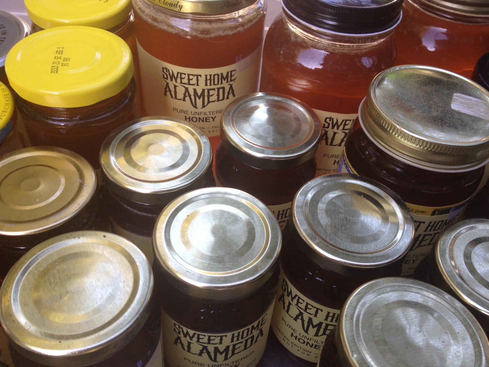
Honey Harvest
I've been keeping bees for a couple of years now — I have been interested in it ever since I heard about Colony Collapse Disorder. It turns out that a lot of people keep bees in an urban environment; in fact, I first found out about urban beekeeping from the leader of the old Bay Area NeXT Group that I attended shortly after NeXT bought Apple. :-)
Anyhow, my hives hadn't been that prodigious — I had a tiny harvest this spring — but this fall, I managed to harvest about 2½ gallons of the sweet stuff! Should be enough to give a few jars to our neighbors and top off our pancakes for the rest of the year!
Will Mozilla Persona succeed where OpenID fails?
Mozilla Persona looks promising. I've tried implementing OpenID on an a private site, and it was a bitch to implement, and is really confusing to the few people who have tried to use it.
Persona doesn't look like it's that much easier to implement, but maybe I'm wrong. One step that looks particularly dubious is where the "identity provider" (owner of your email address) manages requests for certificates. That means that a lot of domanant email providers are going to have to come on-board. That might happen. But if you have your own domain name and you don't want an email address with one of these systems, it's probably not going to be a cakewalk to install the authentication step on your own server.
We'll see. I have hopes for this, but I'm not holding my breath!
Inspired to try this "blogging" thing again
I pick up marketing books from time to time. (I had blogged about marketing as it relates to the Indie Mac Developer a while ago, when I was reading those kinds of books frequently!) I ran across Platform: Get Noticed in a Noisy World by Michael Hyatt. It has inspired me to try blogging again.
I think that I had lost my blogging mojo when I was active in Twitter (and Facebook) but I've been Facebook-free for over a year now, and I've cut down on Twitter a lot.
Maybe if I feel like saying something, it takes more than 140 characters.
Let's see if this sticks.