
I recently wrote a post about how much I love Stripe, and why we changed Karelia Software's online store to use Stripe to process credit cards for people purchasing Sandvox.
This is a followup to that, describing what we did to build our online store, and what decisions came into play for its user experience. (In another followup post, I'll discuss more of the back-end pieces we're using.)
When I realized that we could do just about anything we wanted to collect payments without the limitations we had before, I started looking around at a lot of online stores. I visited websites of fellow indie developers. I looked at the big online retailers. I looked at large retailers with an online presence.
And you know what? Everybody seems to have a different way to collect payments.
For example: some sites take you through multiple steps as you fill in your information. Fill in some fields, click a button to go to the next page, fill out another page or two, and eventually you're done. Others, on the other hand, collect all the information at once, with a single submit button at the bottom.
Different sellers handle input validation and errors differently. Some are proactive, offering helpful suggestions along the way if it looks like you have made a mistake; others wait until you have submitted the form to provide any error messages for you to collect.
After looking at examples and reading some online articles about payment form best practices, I started working on some iterations and refining them with Terrence's and Mike's input.
One overarching goal was to keep the form looking very friendly and simple, but allow for some more complicated scenarios (such as handling coupons or purchasing a gift license).
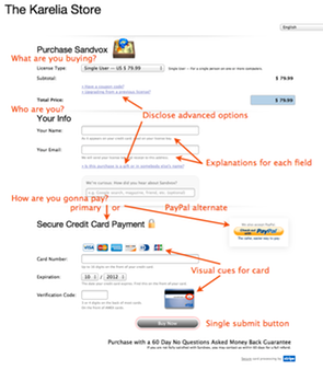
First off, I decided that we wanted a single-step form; it seems to me that the fewer steps there are, the fewer chances we will lose somebody along the way. We wanted to make sure there were plenty of explanations of what the input fields are for, and why we need them. We wanted as much real-time input validation as possible so that there would be a live status update as the visitor clicks from field to field. (More on that in the followup post.)
To keep the more advanced options out of the way, we used simple text links (prefixed with a right-facing disclosure triangle) to allow additional sections to be revealed only if needed.
We put plenty of explanatory text below each field, to provide context for each input. That text even adapts as needed when additional options are disclosed. (Example: the explanation for "Your Name" changes if an advanced section is disclosed.)
Though the inputs are all collected in a single form submission, we felt it was important to group the similar types of input together into discreet chunks. We came up with three main sections: What the visitor is buying — from this a price is calculated. Then, who the license is for. Finally, the actual payment.
As I mentioned in my previous post, we wanted to keep PayPal an an option as well. So after a few iterations, we came on the idea of putting the PayPal button off to the side, at the top of the section where we deal with payment. This lets the visitor choose how to pay after we've collected the other information we need. The normal path is to continue and enter the credit card information, but they can veer off that path and use PayPal instead. This approach seems to work pretty well.
To reassure the visitor that this form is safe, we use the word "secure" above the payment section and feature a lock icon if it's an HTTPS connection. Plus, we link to Stripe and their security page at the bottom.
In the field for the credit card number, we do something clever inspired by GitHub's payment form. Like GitHub, we show icons for the credit cards that Stripe can process. But as the visitor types in a number, the first couple of digits indicate which type of card they are using, so we highlight the card they are using and fade out the others. No point in asking them what type of card they are using; this approach means one less step for the visitor to take, but it visually reinforces the card that they are using.
Naming and explaining the field for the 3- or 4-digit CVC/CVV2 code is never easy, and it varies greatly from website to website. We decided to call it "verification code", explain it below the input field, and provide a little thumbnail for where it can be found on a typical credit card.
Since this code is on the back of most cards but on the front of Amex cards, we do something kind of fun. If you enter an Amex number — try typing "34" in the Card Number field — we animate the card to flip over to show the front of an Amex card. (Also, we highlight the explanatory text referring to the Amex location.) Try it!
That covers most of the design decisions for how to present the credit card input form. Next time around I'll describe what we are doing on the back end to deal with validation, internationalization, and dealing with unfinished transactions.
For the comments: How might you improve this form? (Despite the title, I don't think this is perfect by any means, and maybe there are more improvements we can make to it!) What are some other nice things that companies have done for their payment forms?