Smashing Magazine today published a blog post Better Password Masking For Sign-Up Forms. It suggests that a masked password (where the letters are replaced with ••••••) isn't such a great idea for making an account because you can't see what you have typed. Even if you are asked to enter a new password a second time, it still leaves the possiblity of error.
One suggestion it makes is to unmask the password when the field is focused. That's an intresting idea, but not a great idea if there is a curious person looking over your shoulder.
The final suggesion is a checkbox, where the user can choose whether to mask or unmask the password. That's probably the best compromise, since it lets the person typing the password control things.
(In fact, we're doing something like that on the upcoming version of Sandvox where you are prompted for a password to access a server where your website will be hosted.)
The problem with this approach is that it's up to the creator of the web form to implement that behavior. It's also kind of klunky because it's not really obvious where the checkbox should be placed. Below the field? Above it? To the side?
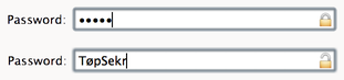
What if, instead, there came into being an adjustment to the password input control on desktop computers that just included the mask/no-mask option in it?
(Here's a super-quick mockup.)